
Personally I don't think I like this idea for all of my work, but hey, it's a learning process and I need the class to graduate.
Most of the frames I try to look up online for artwork seem pretty boring to me. Black, white, or wood stained. I think that is what is expected of us in this class, but I somehow just can't readily accept that.
I know that a frame isn't suppose to over power your piece of work, but with my taste, I am leaning towards the frame becoming part of the piece of art. I don't want it to just accent the piece. I want the frame to outline the focus of the subject and to be thrown in your face.
Some may disagree and totally hate that idea, but who said we all have to think the same :)
I'm going to be that weird girl in class with the two toned blue frame, or the bright red frame, while everyone else has wood or black and white. And I'm okay with that!
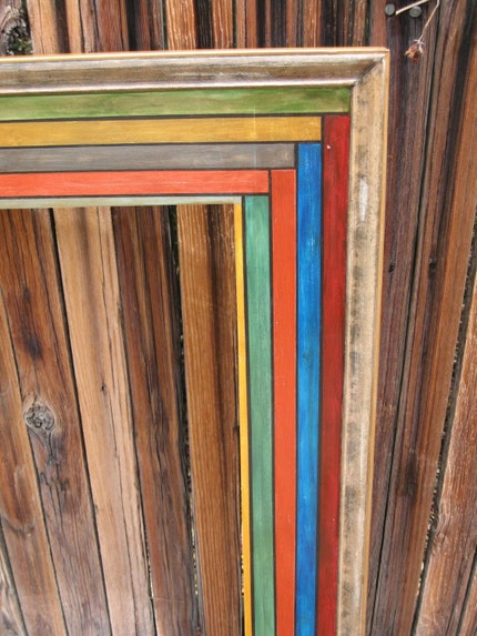
Here are some colored frames that I think look lovely in color:


I will post pictures of my frames with the artwork as I get them finished. I am currently working on a blue one.
Can't wait to share!
Stay tuned for my version of Zuppa Toscana, an Italian soup. I think it will be my last soup of the season!
- Laura
(click pictures for source. The last few are from Etsy, look up frames and find their shops! & some pics from flickr)
0 comments:
Post a Comment